Handrail Audit

Website Accessibility Findings Report

An optometry practice in Los Angeles County

Assessed against the Web Content Accessibility Guidelines (WCAG) 2.1, Level A and Level AA, all 50 success criteria

Engagement reference
A-2026-001
Period of testing
September 2026
Prepared by
Handrail Audit, 3108 Glendale Blvd #105, Los Angeles, CA 90039. Los Angeles County FBN 2026177381
Tester credential
DHS Trusted Tester
Status of this document
Sample report. This report is a sample. The practice is real, one of 42 in our August 2026 study of Los Angeles County optometry websites. Its name, its location, the names of its personnel, its photographs and its suppliers have been removed. Every finding is as tested.

Table of contents

  1. 1. Summary and overall recommendation
  2. 2. Findings overview
    1. 2.1 Level A findings
      1. F-001. The message field on the contact form has no visible label, and its placeholder text disappears when the patient starts to type.
      2. F-002. The privacy notice is rendered as a picture in a canvas element, so a screen reader announces the headings and links and none of the notice.
      3. F-003. Three buttons in the home page photo gallery contain only an icon and have no accessible name, so a screen reader announces each as button.
      4. F-006. Four background photographs on the home page and the practice page announce to a screen reader as images with no description.
      5. F-007. The first photograph in the home page gallery has no alt attribute, so a screen reader announces it as image or reads its file name.
      6. F-008. The frame that holds the third-party advertisement on the home page has no title, so a screen reader announces it as frame with no purpose.
      7. F-009. The icon-only link in the footer of every page has no accessible name and opens a new tab without warning.
      8. F-010. On a phone, the control that opens the menu is a link named after its icon rather than its function.
      9. F-011. The privacy notice page is titled NPP in the browser and in the menu, an abbreviation the website never explains.
      10. F-013. Within the advertisement frame, the advertiser's picture has no alt text, so a screen reader announces it as image.
      11. F-014. Within the advertisement frame, the advertiser's link contains only the unlabeled picture and thus has no accessible name.
    2. 2.2 Level AA findings
      1. F-016. The three contact form fields have no border and a 1.1 to 1 fill, so their edges are not visible on the page.
      2. F-004. Four controls on the home page suppress the focus outline, so a keyboard user loses sight of the focus for four presses of the Tab key.
      3. F-005. The Reviews section heading is white text on a light grey band at a contrast ratio of 1.5 to 1, below the 3 to 1 minimum for large text.
      4. F-012. The page counter in the privacy notice viewer is light grey text at a contrast ratio of 3 to 1, below the 4.5 to 1 minimum.
      5. F-015. The name and email fields on the contact form carry no autocomplete attribute, so a browser cannot identify their purpose or fill them.
      6. F-017. Within the advertisement frame, the advertiser's message is text drawn into the picture and cannot be enlarged, restyled or read aloud.
    3. 2.3 Level AAA
  3. 3. Criteria assessed
  4. 4. Pages within scope
  5. 5. Methodology
  6. 6. Scope limitations
  7. 7. Next steps

Each entry is a link. In the PDF, the bookmarks panel reproduces this list.

1. Summary and overall recommendation

Scope and approach

Handrail Audit was engaged to assess the website of an optometry practice in Los Angeles County against WCAG 2.1 at Level A and Level AA. The assessment covered all five pages of the website and followed one patient task: Find the way to contact the practice, and send a message. There is no online booking on this website. It also assessed the information a patient requires in order to attend: the hours, the location, the insurance accepted, and the privacy notice.

Each page was scanned by an automated engine and then tested by a person with a keyboard, with the browser's accessibility tree, at 200 and 400 percent zoom, and by manual inspection. Every one of the 50 success criteria was assessed individually and is listed with its result in section 3. Every finding in this report was confirmed by a person.

Summary of findings

Findings by severity and by responsible party
SeverityPractice's own markupThird-party frameTotal
Critical000
Serious303
Moderate11314
Total14317
Criteria assessed, WCAG 2.1 Level A and AA
ResultCriteria
Meets the criterion29
Does not meet the criterion10
Not applicable to this website11
Total50

Overall conclusion

On the basis of the procedures performed, the website does not meet 10 of the 39 WCAG 2.1 Level A and AA success criteria that apply to it. No finding prevents a patient from completing the contact task outright. 3 findings in the practice's own markup are rated Serious: each requires a patient to guess, backtrack or seek help on the contact form, or withholds information a patient requires in order to attend. The remaining 11 practice findings are rated Moderate. 3 findings sit within a third-party advertisement and are the supplier's to remediate.

9 of the 17 findings were identified by automated scanning and confirmed by a person. 8 were identified by manual testing and would not have been identified by any automated scan.

Overall recommendation

  1. Remediate the Serious findings first. F-001, F-002, F-016, estimated at 40 to 85 minutes of effort in total. Each lies on the contact path or on information a patient requires.
  2. Remediate the Moderate findings in the practice's markup in the order presented, estimated at 56 to 135 minutes in total. 9 of the practice findings are addressed by a single template change.
  3. Refer the third-party findings to the supplier in the form given in this report, or remove the component.
  4. Commission a re-test of the same pages once remediation is complete. Each finding in this report will then be marked remediated or not remediated with the same evidence.

Total estimated remediation effort for the practice's own markup: 96 to 220 minutes.

2. Findings overview

Findings are grouped by the WCAG level of the criterion they fail, then ordered by severity, with findings in the practice's own markup before findings within third-party components. Each finding is presented in a table with five rows: the finding, its severity and the reason for that rating, its location, the screen reader output where relevant, and a detailed remediation recommendation. An exhibit follows each table where a screenshot was taken. Photographs and identifying text within exhibits are obscured.

Severity ratings

  • Critical. A patient who uses the named assistive technology cannot complete the task at all.
  • Serious. The patient can complete the task only by guessing, backtracking or seeking help; or information the patient requires in order to attend cannot be reached at all.
  • Moderate. The patient completes the task and reaches the information, with something harder or announced incorrectly on the way.

Severity is assessed against the patient's task, not against the element in isolation. An automated engine's own impact rating for the same element may differ. Each finding states the reason for its rating.

2.1 Level A findings

Level A criteria are the minimum level of WCAG 2.1. Each finding in this section fails a Level A criterion.

F-001. The message field on the contact form has no visible label, and its placeholder text disappears when the patient starts to type.

Finding F-001: WCAG 3.3.2 Labels or Instructions, Level A

Finding

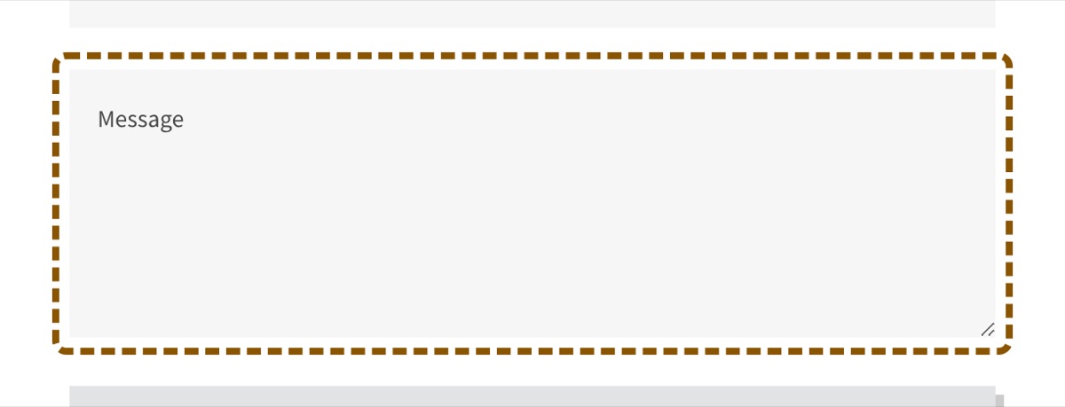
The name and email fields have a label above them that stays on the page. The message field has no label. It has placeholder text inside the field that reads Message, and an aria-label for a screen reader. When the patient types, the placeholder goes away and nothing on the page says what the field is for.

A patient who uses magnification sees one field at a time. With the placeholder gone, the field has no label in view. A patient who is interrupted and comes back to the form cannot tell the message field from an empty field. A screen reader user hears the name, so this finding is about the visible label.

Criterion: WCAG 2.1 success criterion 3.3.2, Labels or Instructions, Level A. Identified by manual testing; confirmed by manual check, keyboard.

Severity

Serious

The form is the task. The field has a name for a screen reader, but its only visible label is the placeholder text, and the placeholder goes away when the patient starts to type. A patient who uses magnification, or who loses their place, cannot see which field this is and must clear the field to find out.

Finding Location

Contact page. The contact form, the third field.

Within the practice's own markup. Instances: 1.

<textarea aria-label="Message" placeholder="Message" ...></textarea>
Screen Reader Output

Message, edit text, multi line.

As announced from the browser's accessibility tree. An NVDA pass is scheduled; see section 6.

Detailed Remediation Recommendation

Give the message field the same visible label as the name and email fields. In the site builder's form settings, set the field label to Message and keep the placeholder empty or use it for a hint.

Where: In the site builder's editor, the contact form block, the message field settings.

Target markup:

<label for="message">Message</label>
<textarea id="message" ...></textarea>

Estimated effort: 5 to 15 minutes per instance. Reference technique: W3C G131.

The contact form. The name and email fields have labels above them. The message field, outlined, shows only the word Message inside it.
Exhibit F-001. The contact form. The name and email fields have labels above them. The message field, outlined, shows only the word Message inside it.

F-002. The privacy notice is rendered as a picture in a canvas element, so a screen reader announces the headings and links and none of the notice.

Finding F-002: WCAG 1.1.1 Non-text Content, Level A

Finding

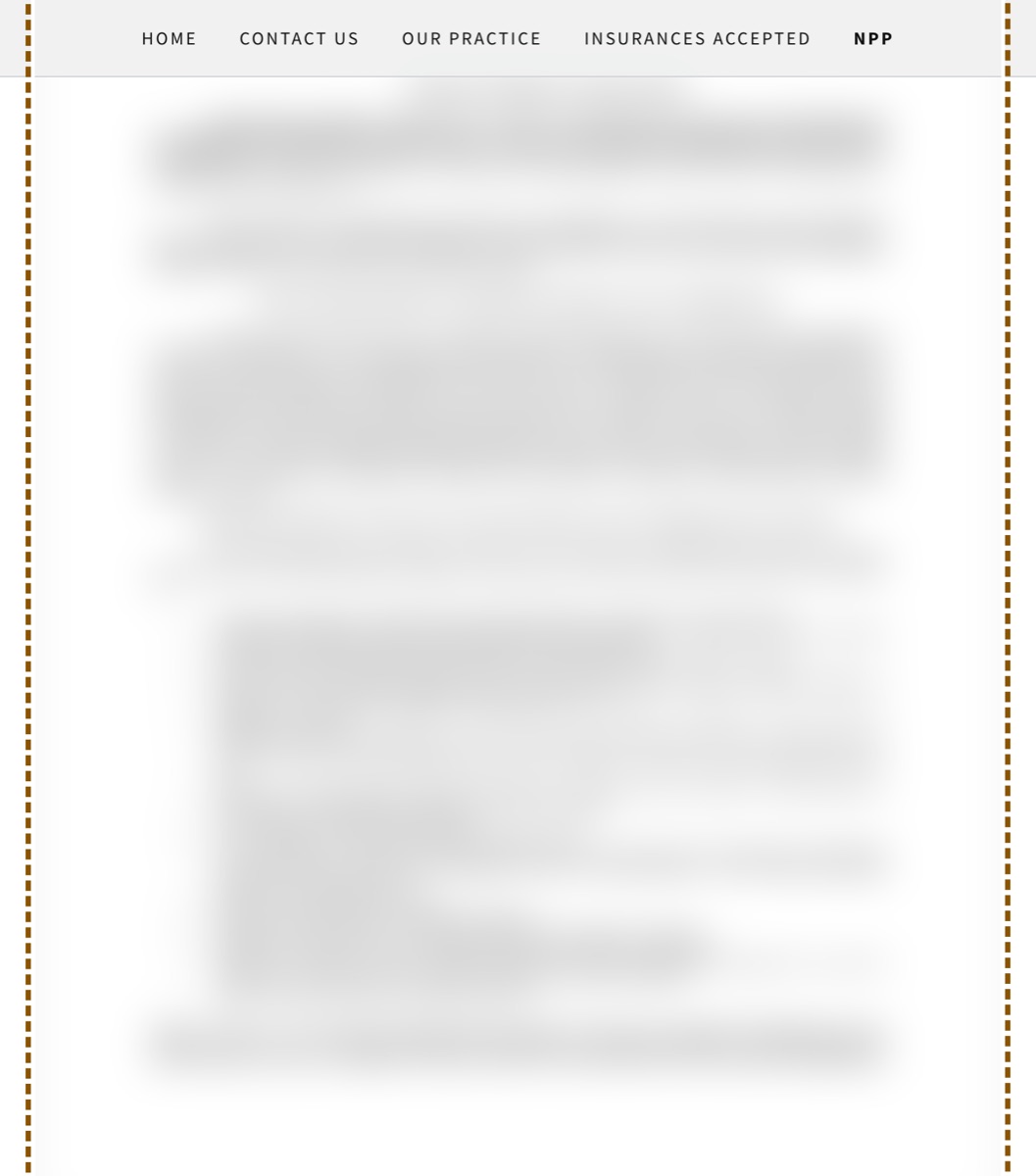
The page shows the notice with the site builder's PDF viewer. The viewer draws each page of the PDF into a canvas, which is a picture with no text. The only text on the page is two headings, two Download PDF links, the page counter, and the Next buttons. The primary region of the page has no readable text.

A patient who uses a screen reader hears the heading and the links, then silence where the notice is. A patient who uses magnification sees a picture of a page that does not reflow, and must scroll in two directions to read it. The Download PDF link opens a separate file, and this audit did not test that file.

Criterion: WCAG 2.1 success criterion 1.1.1, Non-text Content, Level A. Identified by manual testing; confirmed by accessibility tree, manual check.

Severity

Serious

The privacy notice is information the practice must give each patient. On this page it is drawn into a canvas element, which has no text. A screen reader announces the heading, a Download PDF link and a Next button, and nothing of the notice. The patient cannot get to the notice on the page at all.

Finding Location

Privacy notice page. The whole page, in two viewers, one in English and one in Spanish.

Within the practice's own markup. Instances: 2, addressed by a single change.

<canvas data-aid="PDF_PREVIEW_RENDERED" ...></canvas>
<a data-aid="PDF_LINK_OVERLAY" ...></a>
<p data-aid="PDF_PAGE_NOTATION_RENDERED">1/3</p>
Screen Reader Output

Notice of privacy practices, heading level 1. Download PDF, link. Next, button.

As announced from the browser's accessibility tree. An NVDA pass is scheduled; see section 6.

Detailed Remediation Recommendation

Put the notice on the page as text, with headings, in the two languages. Keep the Download PDF link below it. In the site builder, replace the PDF block with a text block and paste the notice.

Where: In the site builder's editor, the privacy notice page, replace the PDF block with a text block.

Target markup:

<h2>Notice of privacy practices</h2>
<p>...the notice, as text, on the page...</p>
<a href="...">Download the notice as a PDF</a>

Estimated effort: 30 to 60 minutes per site.

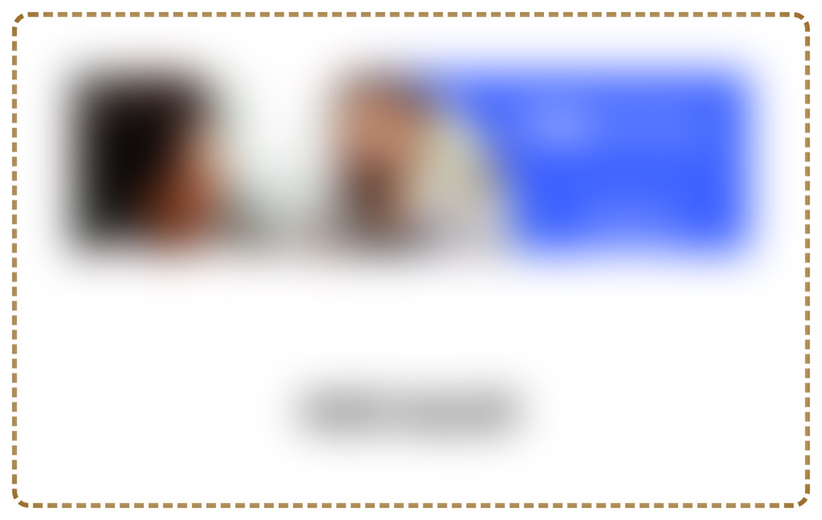
The privacy notice page. The notice appears as an image of a document, blurred, with a page counter and a Next button below it. The image is outlined.
Exhibit F-002. The privacy notice page. The notice appears as an image of a document, blurred, with a page counter and a Next button below it. The image is outlined.

F-003. Three buttons in the home page photo gallery contain only an icon and have no accessible name, so a screen reader announces each as button.

Finding F-003: WCAG 4.1.2 Name, Role, Value, Level A

Finding

The two arrows that move the gallery, and a third button that opens a photo, each contain only an icon. None has text, a label, or a title. The HTML gives each button no name.

A screen reader announces each one as button and nothing more. The patient hears three buttons with no purpose. A patient who uses voice control cannot speak the name of a button that has none.

Criterion: WCAG 2.1 success criterion 4.1.2, Name, Role, Value, Level A. Identified by automated scan (axe-core, rule button-name); confirmed by accessibility tree, keyboard. Related findings: F-004.

Severity

Moderate

The gallery is not on the path to the contact form and holds no information a patient needs to attend. A screen reader announces three controls as button with no purpose. The patient can pass them.

Finding Location

Home page. The photo gallery on the home page, below the services.

Within the practice's own markup. Instances: 3, addressed by a single change.

<button data-ux="CarouselButtonPrevious" class="x-el x-el-button ..."><svg ...></svg></button>
Screen Reader Output

button. button. button.

As announced from the browser's accessibility tree. An NVDA pass is scheduled; see section 6.

Detailed Remediation Recommendation

Give each button a name. In the site builder's editor, the gallery block has settings for the arrow labels. Set them to Previous photo and Next photo. For the third button, set the label to Open photo. If the settings are not there, the builder's support can add an aria-label to each button.

Where: In the site builder's editor, the gallery block settings.

Target markup:

<button data-ux="CarouselButtonPrevious" aria-label="Previous photo" class="..."><svg aria-hidden="true" ...></svg></button>

Estimated effort: 5 to 15 minutes per template. Reference technique: W3C ARIA6.

The photo gallery with its left and right arrow buttons. The right arrow is outlined. The photographs are blurred.
Exhibit F-003. The photo gallery with its left and right arrow buttons. The right arrow is outlined. The photographs are blurred.

F-006. Four background photographs on the home page and the practice page announce to a screen reader as images with no description.

Finding F-006: WCAG 1.1.1 Non-text Content, Level A

Finding

Each photograph is a background on a block, and the block is marked as an image with role=img. An element with that role must have a description. None of the four has one.

A screen reader announces image four times with nothing after it. The patient cannot tell a photograph of the examination room from a decorative texture. If a photograph is decorative, it must not be announced at all.

Criterion: WCAG 2.1 success criterion 1.1.1, Non-text Content, Level A. Identified by automated scan (axe-core, rule role-img-alt); confirmed by accessibility tree.

Severity

Moderate

The photographs decorate the header, the about section and the practice page. They are not on the path to the contact form. A screen reader announces each one as image and the patient does not know whether it mattered.

Finding Location

Home page. The header photograph, the about section photograph, the section background on the home page, and the photograph on the practice page.

Within the practice's own markup. Instances: 4.

<div role="img" data-ux="Background" data-aid="BACKGROUND_IMAGE_RENDERED" style="background-image: url(...)"></div>
Screen Reader Output

image. image. image.

As announced from the browser's accessibility tree. An NVDA pass is scheduled; see section 6.

Detailed Remediation Recommendation

For each photograph, decide whether it carries information. If it is decorative, mark it so. In the site builder, the block's image control has a decorative option or an empty description field. If it shows something a patient must know, such as the examination room, give it a short description.

Where: In the site builder's editor, each section's background image settings.

Target markup:

<div data-ux="Background" role="presentation" style="background-image: url(...)"></div>  or  <div role="img" aria-label="The examination room" ...></div>

Estimated effort: 2 to 5 minutes per instance. Reference technique: W3C ARIA10.

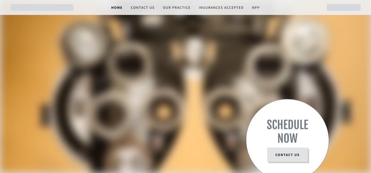
The header of the home page: a large photograph, blurred, behind the navigation, outlined.
Exhibit F-006. The header of the home page: a large photograph, blurred, behind the navigation, outlined.

F-007. The first photograph in the home page gallery has no alt attribute, so a screen reader announces it as image or reads its file name.

Finding F-007: WCAG 1.1.1 Non-text Content, Level A

Finding

The photograph has no alt attribute. The other photograph on the site, on the insurance page, has a good description, so the practice knows how to write one.

A screen reader announces image, or reads the file name, which is a string of letters. The patient does not know what the photograph shows.

Criterion: WCAG 2.1 success criterion 1.1.1, Non-text Content, Level A. Identified by automated scan (axe-core, rule image-alt); confirmed by accessibility tree.

Severity

Moderate

The gallery is not on the path to the contact form. A screen reader announces the photograph as image with no description. The patient loses the photograph and nothing else.

Finding Location

Home page. The photo gallery on the home page, the first photograph.

Within the practice's own markup. Instances: 1.

<img data-ux="Image" data-aid="GALLERY_IMAGE0_RENDERED" src="...">
Screen Reader Output

image.

As announced from the browser's accessibility tree. An NVDA pass is scheduled; see section 6.

Detailed Remediation Recommendation

Give the photograph a short description of what it shows. In the site builder, the gallery block has a description field for each photograph.

Where: In the site builder's editor, the gallery block, the photograph's description field.

Target markup:

<img data-ux="Image" data-aid="GALLERY_IMAGE0_RENDERED" src="..." alt="A child in new glasses">

Estimated effort: 2 to 5 minutes per instance. Reference technique: W3C H37.

A photograph in the gallery, blurred, outlined.
Exhibit F-007. A photograph in the gallery, blurred, outlined.

F-008. The frame that holds the third-party advertisement on the home page has no title, so a screen reader announces it as frame with no purpose.

Finding F-008: WCAG 4.1.2 Name, Role, Value, Level A

Finding

The frame that holds the advertisement has no title attribute. The frame is in the practice's own markup. The advertisement in it belongs to the advertiser.

A screen reader announces frame and nothing more. The patient does not know whether the frame is the way to book, a map, or an advertisement, until they enter it.

Criterion: WCAG 2.1 success criterion 4.1.2, Name, Role, Value, Level A. Identified by automated scan (axe-core, rule frame-title); confirmed by accessibility tree. Related findings: F-012, F-013.

Severity

Moderate

The frame holds a third-party advertisement between the services and the gallery. It is not on the path to the contact form. A screen reader announces frame with no name, and the patient must enter it to learn what it is.

Finding Location

Home page. Between the services and the photo gallery on the home page.

Within the practice's own markup. Instances: 1.

<iframe id="iframe-..." sandbox="allow-scripts ..." srcdoc="..."></iframe>
Screen Reader Output

frame.

As announced from the browser's accessibility tree. An NVDA pass is scheduled; see section 6.

Detailed Remediation Recommendation

Give the frame a title that says what it is: Advertisement for vision insurance. In the site builder, the HTML block that holds the advertisement code lets you edit that code. Add title="Advertisement for vision insurance" to the iframe tag.

Where: In the site builder's editor, the HTML block on the home page.

Target markup:

<iframe id="iframe-..." title="Advertisement for vision insurance" sandbox="..." srcdoc="..."></iframe>

Estimated effort: 2 to 5 minutes per instance. Reference technique: W3C H64.

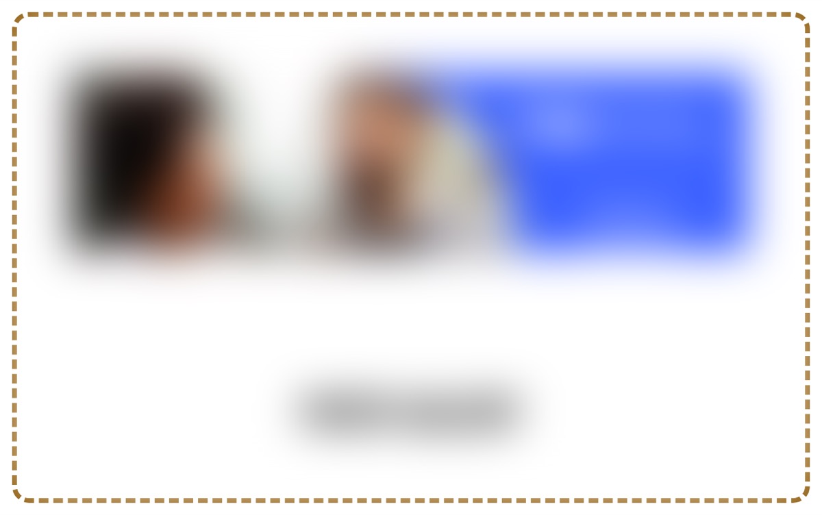
The advertisement banner, blurred, outlined. It sits between two sections of the home page.
Exhibit F-008. The advertisement banner, blurred, outlined. It sits between two sections of the home page.

F-009. The icon-only link in the footer of every page has no accessible name and opens a new tab without warning.

Finding F-009: WCAG 2.4.4 Link Purpose (In Context), Level A

Finding

The link contains only an icon. It has no text and no label. It opens a new tab, and nothing tells the patient that.

A screen reader announces link and nothing more, at the end of every page. The patient does not know where it goes. If they follow it, a new tab opens without warning.

Criterion: WCAG 2.1 success criterion 2.4.4, Link Purpose (In Context), Level A. Identified by automated scan (axe-core, rule link-name); confirmed by accessibility tree.

Severity

Moderate

The link is the site builder's credit in the footer. It is not on the path to the contact form. A screen reader announces link with no name, once per page, and the patient passes it.

Finding Location

Home page. The footer, the last item, on every page.

Within the practice's own markup. Instances: 5, addressed by a single change.

<a rel="nofollow noopener" role="link" aria-haspopup="true" data-ux="Link" target="_blank" href="..."><svg ...></svg></a>
Screen Reader Output

link.

As announced from the browser's accessibility tree. An NVDA pass is scheduled; see section 6.

Detailed Remediation Recommendation

The link is part of the site builder's footer and the practice cannot edit its markup. Two options: turn the credit off in the site settings, if the plan allows it, or ask the builder's support to add a label. The label must say where the link goes and that it opens a new tab.

Where: In the site builder's site settings, or through the builder's support.

Target markup:

<a ... aria-label="Website built with [the site builder]"><svg aria-hidden="true" ...></svg></a>

Estimated effort: 5 to 10 minutes per template. Reference technique: W3C ARIA8.

The footer of the home page. A small icon-only link at the end of the copyright line is outlined. The icon is blurred.
Exhibit F-009. The footer of the home page. A small icon-only link at the end of the copyright line is outlined. The icon is blurred.

F-010. On a phone, the control that opens the menu is a link named after its icon rather than its function.

Finding F-010: WCAG 2.4.4 Link Purpose (In Context), Level A

Finding

The control that opens the menu is a link with the name Hamburger Site Navigation Icon. The name describes the icon. The control opens a menu, so it is a button, and its name must say what it does.

A screen reader announces Hamburger Site Navigation Icon, link. The patient must work out that this opens the menu. A patient who uses voice control says the name of the control to push it, and the name is four words about an icon.

Criterion: WCAG 2.1 success criterion 2.4.4, Link Purpose (In Context), Level A. Identified by manual testing; confirmed by accessibility tree, at phone width.

Severity

Moderate

On a phone the menu is the way to the contact page. The button can be found and opened, and its name does say Site Navigation, so the patient gets there. The name is wrong, not missing.

Finding Location

Home page. The top right of every page, on a phone.

Within the practice's own markup. Instances: 5, addressed by a single change.

<a href="#" role="link" aria-label="Hamburger Site Navigation Icon" aria-expanded="false">...</a>
Screen Reader Output

Hamburger Site Navigation Icon, link, collapsed.

As announced from the browser's accessibility tree. An NVDA pass is scheduled; see section 6.

Detailed Remediation Recommendation

Name the control Menu, and make it a button. The site builder sets this name in its theme, so the change is a request to the builder's support.

Where: In the site builder's theme, through the builder's support.

Target markup:

<button aria-label="Menu" aria-expanded="false">...</button>

Estimated effort: 5 to 10 minutes per template. Reference technique: W3C ARIA8.

The top of the home page on a phone. The three-line menu icon at the top right is outlined.
Exhibit F-010. The top of the home page on a phone. The three-line menu icon at the top right is outlined.

F-011. The privacy notice page is titled NPP in the browser and in the menu, an abbreviation the website never explains.

Finding F-011: WCAG 2.4.2 Page Titled, Level A

Finding

The page title is NPP. The menu link is NPP. The abbreviation is not explained anywhere on the site. The other page titles name the page but not the practice.

A screen reader announces the page title first when a page opens, and reads the menu as a list of names. A patient who does not know that NPP means notice of privacy practices cannot find the notice.

Criterion: WCAG 2.1 success criterion 2.4.2, Page Titled, Level A. Identified by manual testing; confirmed by manual check.

Severity

Moderate

The page can be reached and opened. Its name does not say what it is, so a patient who wants the privacy notice does not know that this is the page. The information is reachable, with a guess.

Finding Location

Privacy notice page. The page title in the browser tab, and the menu link that opens the page.

Within the practice's own markup. Instances: 2, addressed by a single change.

<title>NPP</title>  and  <a href="/npp">NPP</a>
Screen Reader Output

NPP, link. NPP, page.

As announced from the browser's accessibility tree. An NVDA pass is scheduled; see section 6.

Detailed Remediation Recommendation

Rename the page Privacy notice in the site builder. The page title and the menu link follow the page name. Add the practice name to every page title in the site settings.

Where: In the site builder's editor, the page settings for this page, and the site settings for titles.

Target markup:

<title>Notice of privacy practices | [practice]</title>  and  <a href="/npp">Privacy notice</a>

Estimated effort: 5 to 10 minutes per site. Reference technique: W3C G88.

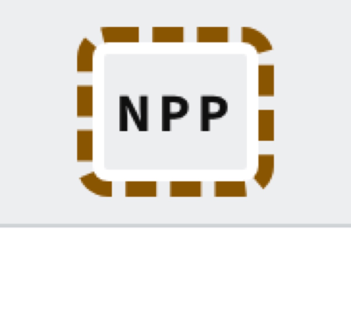
The navigation bar with the menu links. The last link, NPP, is outlined.
Exhibit F-011. The navigation bar with the menu links. The last link, NPP, is outlined.

F-013. Within the advertisement frame, the advertiser's picture has no alt text, so a screen reader announces it as image.

Finding F-013: WCAG 1.1.1 Non-text Content, Level A, within a third-party advertisement

Finding

The advertisement is one picture with the advertiser's message drawn into it. The picture has no alt attribute.

A screen reader announces image. The patient gets none of the advertiser's message. This is the advertiser's failure, in the advertiser's code.

Criterion: WCAG 2.1 success criterion 1.1.1, Non-text Content, Level A. Identified by automated scan (axe-core, rule image-alt); confirmed by accessibility tree. Related findings: F-008.

Severity

Moderate

The advertisement belongs to the advertiser, not the practice. It is not on the path to the contact form. A screen reader announces image with no description.

Finding Location

Home page. Inside the advertisement frame on the home page.

Within a third-party advertisement. The code belongs to the supplier, and remediation is the supplier's to perform. Instances: 1.

<img class="adEmbedImage" src="...">
Screen Reader Output

image.

As announced from the browser's accessibility tree. An NVDA pass is scheduled; see section 6.

Detailed Remediation Recommendation

Send this finding to the advertiser: the embed's image needs alt text that gives the message in the picture. The practice cannot change the advertiser's code. The practice can remove the advertisement.

Where: The advertiser's embed code.

Target markup:

<img class="adEmbedImage" src="..." alt="[the advertiser's message]">

Estimated effort: 2 to 5 minutes per instance. Reference technique: W3C H37.

The picture inside the advertisement, blurred, outlined.
Exhibit F-013. The picture inside the advertisement, blurred, outlined.

F-014. Within the advertisement frame, the advertiser's link contains only the unlabeled picture and thus has no accessible name.

Finding F-014: WCAG 2.4.4 Link Purpose (In Context), Level A, within a third-party advertisement

Finding

The whole advertisement is one link around the picture. Because the picture has no alt text, the link has no name. It opens a new tab without saying so.

A screen reader announces link. The patient does not know where it goes or that a new tab will open.

Criterion: WCAG 2.1 success criterion 2.4.4, Link Purpose (In Context), Level A. Identified by automated scan (axe-core, rule link-name); confirmed by accessibility tree. Related findings: F-013.

Severity

Moderate

The advertisement belongs to the advertiser, not the practice. It is not on the path to the contact form. A screen reader announces link with no name.

Finding Location

Home page. Inside the advertisement frame on the home page.

Within a third-party advertisement. The code belongs to the supplier, and remediation is the supplier's to perform. Instances: 1.

<a class="adEmbedAnchor" target="_blank" href="..."><img class="adEmbedImage" src="..."></a>
Screen Reader Output

link.

As announced from the browser's accessibility tree. An NVDA pass is scheduled; see section 6.

Detailed Remediation Recommendation

Send this finding to the advertiser with F-013. Alt text on the picture gives the link its name. The practice cannot change the advertiser's code.

Where: The advertiser's embed code.

Target markup:

<a class="adEmbedAnchor" target="_blank" href="..." aria-label="[the advertiser's offer], opens in a new tab"><img ...></a>

Estimated effort: 2 to 5 minutes per instance. Reference technique: W3C H30.

2.2 Level AA findings

Level AA criteria are the level named by the 2024 HHS Section 504 rule and by the 2024 Department of Justice rule under Title II of the ADA. Each finding in this section fails a Level AA criterion.

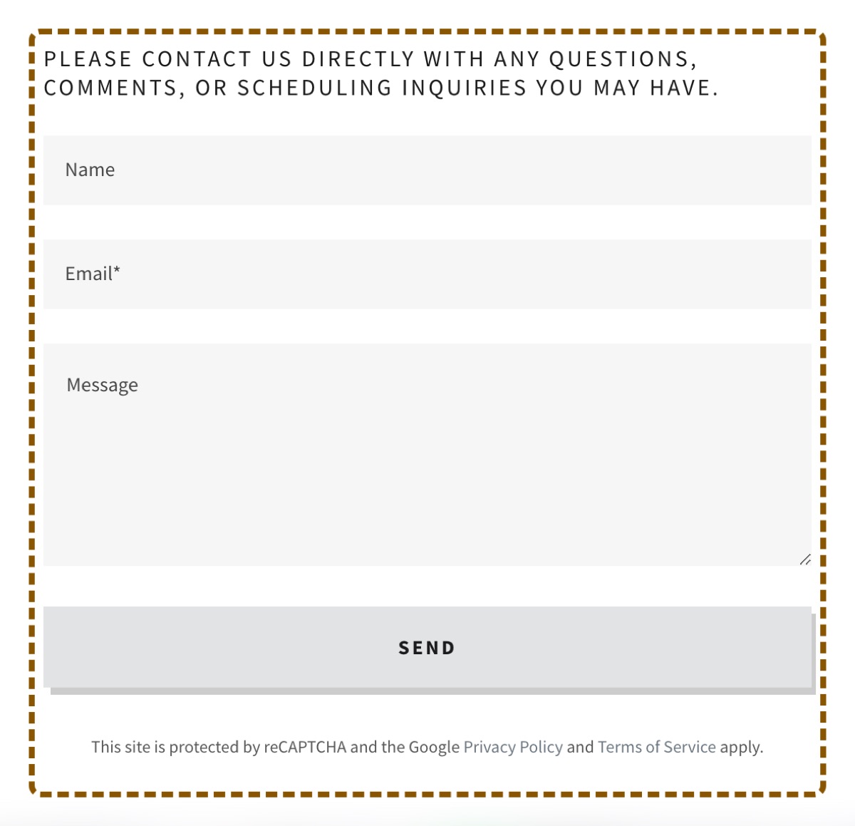
F-016. The three contact form fields have no border and a 1.1 to 1 fill, so their edges are not visible on the page.

Finding F-016: WCAG 1.4.11 Non-text Contrast, Level AA

Finding

Each field is drawn as a light grey rectangle with no border. The grey is #f6f6f6 and the page behind it is white. The contrast ratio is 1.1 to 1. The minimum for the edge of a control is 3 to 1.

A patient with low vision sees the labels and the Send button and a white space between them. The fields are there, but their edges are not. The patient clicks where a field must be and hopes. A patient who uses magnification sees only part of the form at a time and has no edge to follow.

Criterion: WCAG 2.1 success criterion 1.4.11, Non-text Contrast, Level AA. Identified by manual testing; confirmed by manual check, measured.

Severity

Serious

The form is the task. Each field is a very light grey box on a white page with no border. The contrast between the box and the page is 1.1 to 1. A patient with low vision cannot see where a field begins or ends and must guess where to click or type.

Finding Location

Contact page. The contact form, all three fields.

Within the practice's own markup. Instances: 3, addressed by a single change.

input, textarea { background: #f6f6f6; border: 0; } on a page background of #ffffff
Screen Reader Output

Not applicable. This finding concerns visual presentation or keyboard operation rather than screen reader output.

Detailed Remediation Recommendation

Give each field a border of at least 3 to 1 against the page: a mid-grey line, #767676 or darker, one pixel wide. In the site builder, the form block's style control has a field border option.

Where: In the site builder's editor, the contact form block, style controls.

Target markup:

input, textarea { background: #f6f6f6; border: 1px solid #767676; }

Estimated effort: 5 to 10 minutes per template. Reference technique: W3C G195.

The contact form, outlined. Three labels with faint grey rectangles below them and a Send button.
Exhibit F-016. The contact form, outlined. Three labels with faint grey rectangles below them and a Send button.

F-004. Four controls on the home page suppress the focus outline, so a keyboard user loses sight of the focus for four presses of the Tab key.

Finding F-004: WCAG 2.4.7 Focus Visible, Level AA

Finding

Every link and button on the page shows a focus outline when the patient moves to it with the Tab key, except four. The style for the gallery buttons and the frame removes the outline and puts nothing in its place.

A patient who cannot use a mouse moves through the page with the Tab key and follows the outline. After the contact button, the outline goes away for four presses. The patient does not know where they are on the page until the outline comes back at the telephone number in the footer.

Criterion: WCAG 2.1 success criterion 2.4.7, Focus Visible, Level AA. Identified by manual testing; confirmed by keyboard. Related findings: F-003.

Severity

Moderate

The four controls are the advertisement frame and the three gallery buttons. They are not on the path to the contact form. A patient who uses the keyboard loses sight of the focus for four pushes of the Tab key and finds it again at the footer.

Finding Location

Home page. The advertisement frame and the photo gallery on the home page.

Within the practice's own markup. Instances: 4, addressed by a single change.

button[data-ux="CarouselButtonNext"] { outline: none; }
Screen Reader Output

Not applicable. This finding concerns visual presentation or keyboard operation rather than screen reader output.

Detailed Remediation Recommendation

Remove the style that hides the outline on these four controls, or give them the same outline as the other controls. The site builder has no control for this. The builder's support must change the theme style.

Where: In the site builder's theme style, through the builder's support.

Target markup:

button[data-ux="CarouselButtonNext"]:focus-visible { outline: 3px solid #000; outline-offset: 3px; }

Estimated effort: 15 to 30 minutes per template. Reference technique: W3C G149.

The gallery arrow button with keyboard focus on it. No outline is shown. The button is outlined by this report to show where it is.
Exhibit F-004. The gallery arrow button with keyboard focus on it. No outline is shown. The button is outlined by this report to show where it is.

F-005. The Reviews section heading is white text on a light grey band at a contrast ratio of 1.5 to 1, below the 3 to 1 minimum for large text.

Finding F-005: WCAG 1.4.3 Contrast (Minimum), Level AA

Finding

The heading is white text on a light grey band. The contrast ratio is 1.5 to 1. The minimum for text of this size is 3 to 1, and for body text 4.5 to 1.

A patient with low vision, or a patient in bright light, sees a grey band with a faint shape in it. The word Reviews is not readable.

Criterion: WCAG 2.1 success criterion 1.4.3, Contrast (Minimum), Level AA. Identified by automated scan (axe-core, rule color-contrast); confirmed by manual check, measured.

Severity

Moderate

The heading is not on the path to the contact form and the reviews are not information a patient needs to attend. A patient with low vision cannot read the heading and finds the section by its content instead.

Finding Location

Home page. The Reviews section of the home page, its title.

Within the practice's own markup. Instances: 1.

<h2 data-aid="REVIEWS_SECTION_TITLE_RENDERED" style="color: #fff">Reviews</h2> on a background of #d0d0d8
Screen Reader Output

Not applicable. This finding concerns visual presentation or keyboard operation rather than screen reader output.

Detailed Remediation Recommendation

Change the heading color to a dark color, or change the band behind it to a dark color. In the site builder, the reviews section has a color control. Choose a dark text color.

Where: In the site builder's editor, the reviews section, color settings.

Target markup:

<h2 data-aid="REVIEWS_SECTION_TITLE_RENDERED" style="color: #1b1b1b">Reviews</h2>

Estimated effort: 5 to 10 minutes per instance. Reference technique: W3C G18.

A light grey band across the page with the word Reviews in white, barely visible, outlined.
Exhibit F-005. A light grey band across the page with the word Reviews in white, barely visible, outlined.

F-012. The page counter in the privacy notice viewer is light grey text at a contrast ratio of 3 to 1, below the 4.5 to 1 minimum.

Finding F-012: WCAG 1.4.3 Contrast (Minimum), Level AA

Finding

The counter is light grey text on a near-white background. The contrast ratio is 3 to 1. The minimum for text of this size is 4.5 to 1.

A patient with low vision cannot read which page of the notice is open.

Criterion: WCAG 2.1 success criterion 1.4.3, Contrast (Minimum), Level AA. Identified by automated scan (axe-core, rule color-contrast); confirmed by manual check, measured. Related findings: F-002.

Severity

Moderate

The counter shows which page of the notice is open. The notice itself is the subject of finding F-002. A patient with low vision cannot read the counter and can still push Next.

Finding Location

Privacy notice page. Below each of the two notice viewers, the text that reads 1/3.

Within the practice's own markup. Instances: 2, addressed by a single change.

<p data-aid="PDF_PAGE_NOTATION_RENDERED" style="color: #8d9196">1/3</p> on #f8f8f8
Screen Reader Output

Not applicable. This finding concerns visual presentation or keyboard operation rather than screen reader output.

Detailed Remediation Recommendation

The counter is part of the site builder's PDF viewer and its color is set by the theme. If the notice is put on the page as text, as F-002 recommends, the viewer and this counter go away. Otherwise ask the builder's support to darken the counter.

Where: Corrected by F-002, or through the builder's support.

Target markup:

<p data-aid="PDF_PAGE_NOTATION_RENDERED" style="color: #595959">1/3</p>

Estimated effort: 0 to 10 minutes per template. Reference technique: W3C G18.

The bottom of a notice viewer: a faint grey 1/3 and a Next button. The counter is outlined.
Exhibit F-012. The bottom of a notice viewer: a faint grey 1/3 and a Next button. The counter is outlined.

F-015. The name and email fields on the contact form carry no autocomplete attribute, so a browser cannot identify their purpose or fill them.

Finding F-015: WCAG 1.3.5 Identify Input Purpose, Level AA

Finding

The name field and the email field have no autocomplete attribute. The email field is a plain text field, not an email field. The browser has no way to know that these fields want the patient's name and email address.

A patient with a motor or cognitive disability often relies on the browser to fill their name and email address. With no autocomplete attribute, the browser offers nothing and the patient types each field by hand. A patient on a phone does not get the email keyboard for the email field.

Criterion: WCAG 2.1 success criterion 1.3.5, Identify Input Purpose, Level AA. Identified by manual testing; confirmed by manual check.

Severity

Moderate

The form is the task, and the patient can complete it. A browser or an assistive tool that fills forms cannot fill these two fields, so a patient who depends on that types them by hand.

Finding Location

Contact page. The contact form, the first and second fields.

Within the practice's own markup. Instances: 2, addressed by a single change.

<input type="text" id="input3"> with the label Name
<input type="text" id="input4"> with the label Email*
Screen Reader Output

Not applicable. This finding concerns visual presentation or keyboard operation rather than screen reader output.

Detailed Remediation Recommendation

Set autocomplete to name on the name field and to email on the email field, and make the email field an email field. In the site builder, the form block's field type control has Name and Email types that do this.

Where: In the site builder's editor, the contact form block, each field's type control.

Target markup:

<input type="text" id="input3" autocomplete="name">
<input type="email" id="input4" autocomplete="email">

Estimated effort: 2 to 5 minutes per instance. Reference technique: W3C H98.

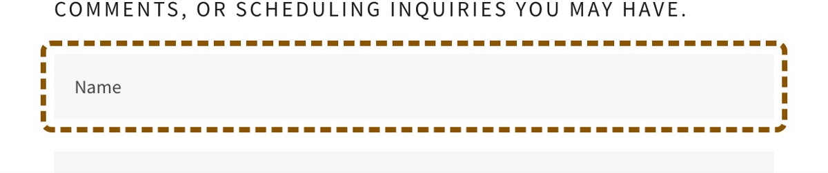
The contact form. The name field, outlined, and the email field below it.
Exhibit F-015. The contact form. The name field, outlined, and the email field below it.

F-017. Within the advertisement frame, the advertiser's message is text drawn into the picture and cannot be enlarged, restyled or read aloud.

Finding F-017: WCAG 1.4.5 Images of Text, Level AA, within a third-party advertisement

Finding

The advertisement's message is part of the picture. It is not text on the page. A patient cannot enlarge it, change its font, or change its colors, and a screen reader cannot read it.

A patient who sets a larger text size gets larger page text and the same small picture. A patient who uses high contrast mode gets the picture's own colors. The advertiser's message is closed to them.

Criterion: WCAG 2.1 success criterion 1.4.5, Images of Text, Level AA. Identified by manual testing; confirmed by manual check. Related findings: F-013, F-014.

Severity

Moderate

The advertisement belongs to the advertiser, not the practice. It is not on the path to the contact form. A patient who enlarges text or changes its colors cannot do either to text that is a picture.

Finding Location

Home page. Inside the advertisement frame on the home page.

Within a third-party advertisement. The code belongs to the supplier, and remediation is the supplier's to perform. Instances: 1.

<img class="adEmbedImage" src="..."> with the advertiser's offer as text in the picture
Screen Reader Output

Not applicable. This finding concerns visual presentation or keyboard operation rather than screen reader output.

Detailed Remediation Recommendation

Send this finding to the advertiser with F-013 and F-014: put the message on the page as text, or give the picture alt text that carries the message in full. The practice cannot change the advertiser's code. The practice can remove the advertisement.

Where: The advertiser's embed code.

Target markup:

The offer as HTML text over a picture, or in the picture with the same text in the alt attribute

Estimated effort: 10 to 30 minutes per instance. Reference technique: W3C C22.

The advertisement banner, blurred, outlined.
Exhibit F-017. The advertisement banner, blurred, outlined.

2.3 Level AAA

Level AAA criteria were outside the scope of this engagement. WCAG 2.1 contains 28 Level AAA criteria. The W3C does not recommend Level AAA as a general requirement, and neither the 2024 HHS Section 504 rule nor the 2024 Department of Justice rule names it. No procedures were performed against Level AAA and no conclusion is expressed on it. An assessment against Level AAA can be added as an extension of this engagement.

3. Criteria assessed

Every success criterion of WCAG 2.1 at Level A and Level AA, with the result of this assessment. A criterion is recorded as not applicable where the website has no content of the kind the criterion governs. 39 of the applicable criteria were assessed by a person; an automated engine alone assesses none of them completely.

WCAG 2.1 Level A and AA, all 50 success criteria
CriterionLevelResultAssessed byFindings, or basis for not applicable
1.1.1 Non-text ContentADoes not meet the criterionScan and a personF-002, F-006, F-007, F-013
1.2.1 Audio-only and Video-only (Prerecorded)ANot applicableA personThe website has no audio and no video.
1.2.2 Captions (Prerecorded)ANot applicableA personThe website has no audio and no video.
1.2.3 Audio Description or Media Alternative (Prerecorded)ANot applicableA personThe website has no audio and no video.
1.2.4 Captions (Live)AANot applicableA personThe website has no audio and no video.
1.2.5 Audio Description (Prerecorded)AANot applicableA personThe website has no audio and no video.
1.3.1 Info and RelationshipsAMeets the criterionScan and a personHeadings are real headings, the menu is a list, the form fields have names. Read by headings and by landmarks on every page.
1.3.2 Meaningful SequenceAMeets the criterionA personThe Tab order and the accessibility tree follow the visual order on every page.
1.3.3 Sensory CharacteristicsAMeets the criterionA personNo instruction on the website refers to a shape, a color or a position alone.
1.3.4 OrientationAAMeets the criterionA personNo stylesheet hides content in one orientation. The pages were opened at phone width in each orientation.
1.3.5 Identify Input PurposeAADoes not meet the criterionA personF-015
1.4.1 Use of ColorAMeets the criterionScan and a personLinks in the text are underlined. The necessary field is marked with an asterisk in its label. The message for a wrong entry is text.
1.4.2 Audio ControlANot applicableA personThe website has no audio.
1.4.3 Contrast (Minimum)AADoes not meet the criterionScan and a personF-005, F-012
1.4.4 Resize TextAAMeets the criterionA personAt 200 percent zoom every text is readable on every page. The review cards cut long reviews short with a link, which is by design.
1.4.5 Images of TextAADoes not meet the criterionA personF-017
1.4.10 ReflowAAMeets the criterionA personAt 320 pixels wide every page reflows to one column with no sideways scrolling.
1.4.11 Non-text ContrastAADoes not meet the criterionA personF-016
1.4.12 Text SpacingAAMeets the criterionScan and a personNo style blocks a change to line height or spacing. The scan's text-spacing rule passes on every page.
1.4.13 Content on Hover or FocusAANot applicableA personNothing appears on hover or on focus alone. The More menu's links are in the menu already, and the menu opens on click.
2.1.1 KeyboardAMeets the criterionScan and a personEvery control on every page can be reached and operated with the Tab key and Enter.
2.1.2 No Keyboard TrapAMeets the criterionA personThe Tab key moves through every control on every page and back to the top. There is no trap.
2.1.4 Character Key ShortcutsANot applicableA personThe website has no single-key shortcuts and no accesskey attributes.
2.2.1 Timing AdjustableANot applicableA personThe website has no time limit. The reCAPTCHA is a third-party control and is listed with what we did not test.
2.2.2 Pause, Stop, HideAMeets the criterionScan and a personThe photo gallery does not move on its own. Nothing else moves.
2.3.1 Three Flashes or Below ThresholdAMeets the criterionA personNothing flashes. The pages have no animation, no animated image and no video.
2.4.1 Bypass BlocksAMeets the criterionScan and a personEvery page has a primary landmark and a navigation landmark, so a screen reader user can jump past the header.
2.4.2 Page TitledADoes not meet the criterionScan and a personF-011
2.4.3 Focus OrderAMeets the criterionA personFocus moves in reading order on every page. It does not jump.
2.4.4 Link Purpose (In Context)ADoes not meet the criterionScan and a personF-009, F-010, F-014
2.4.5 Multiple WaysAAMeets the criterionA personThe menu on every page links to every page, and the home page links to the contact page in its text. A site map or a search would be a third way.
2.4.6 Headings and LabelsAAMeets the criterionA personHeadings describe their sections. The two labeled fields describe their content.
2.4.7 Focus VisibleAADoes not meet the criterionA personF-004
2.5.1 Pointer GesturesAMeets the criterionA personThe photo gallery can be moved with its arrow buttons. Nothing needs a swipe or a pinch.
2.5.2 Pointer CancellationAMeets the criterionA personNo control fires on the down event. Every click completes on release, which is the browser's default.
2.5.3 Label in NameAMeets the criterionScan and a personEvery control with visible text has that text in its name.
2.5.4 Motion ActuationANot applicableA personNothing on the website responds to the device being moved.
3.1.1 Language of PageAMeets the criterionScan and a personThe page language is set on every page.
3.1.2 Language of PartsAAMeets the criterionScan and a personThe Spanish privacy notice is a picture, so there is no Spanish text to mark. Finding F-002 covers the picture.
3.2.1 On FocusAMeets the criterionA personMoving focus to a control does not open a page or move focus elsewhere.
3.2.2 On InputAMeets the criterionA personNo field submits the form or changes the page when its value changes.
3.2.3 Consistent NavigationAAMeets the criterionA personThe menu is the same, in the same order, on every page.
3.2.4 Consistent IdentificationAAMeets the criterionA personThe same links have the same names on every page. The menu link and the button to the contact page differ only in capital letters.
3.3.1 Error IdentificationAMeets the criterionA personThe form submitted empty shows a message in text that names the email field.
3.3.2 Labels or InstructionsADoes not meet the criterionScan and a personF-001
3.3.3 Error SuggestionAAMeets the criterionA personThe message says what to do: enter a valid email address.
3.3.4 Error Prevention (Legal, Financial, Data)AANot applicableA personThe contact form has no legal or financial effect and changes no stored data.
4.1.1 ParsingAMeets the criterionScan and a personNo duplicate id is referenced by a label or an ARIA attribute on each page.
4.1.2 Name, Role, ValueADoes not meet the criterionScan and a personF-003, F-008
4.1.3 Status MessagesAAMeets the criterionA personThe form's message is in an element with an alert role, so a screen reader announces it. The role is alertdialog, which is not the usual role for a message, but it is announced.

4. Pages within scope

Every page of the website: five pages, of which three are light pages. The path a patient takes to contact the practice is the home page, then the contact page, then the form.

Pages within scope
ReferencePageWordsLight pageScannedTested by a personFindings
P-01Home555NoYesYes11
P-02Contact132NoYesYes5
P-03Practice144YesYesYes3
P-04Insurance61YesYesYes2
P-05Privacy notice43YesYesYes5

5. Methodology

Tools and techniques
ToolVersionApplied to
axe-core4.12.1Automated scan of each page, through Playwright 1.62.1
Criterion reviewHandrail Audit protocol, pass 4bEvidence for the criteria the scan never touches: media, timing, shortcuts, orientation, input purpose, images of text, non-text contrast, hover content, focus and input changes, consistency, parsing, status messages
KeyboardEvery control on every page, in order, with the Tab key and Shift and Tab
Accessibility treeChromium, through Playwright 1.62.1The names and roles a screen reader announces. A pass with NVDA itself is scheduled
Browser zoom200 and 400 percentText size and reflow
Procedures and hours, 10.0 in total
ProcedureHours
Automated scan of each page0.2
Keyboard testing of every control, by hand1.5
Screen reader names and roles, from the accessibility tree2
Manual assessment of criteria an automated engine cannot assess3.3
Severity rating and ordering1
Judgement, write-up and quality review2

6. Scope limitations

Matters outside the procedures performed, and matters examined that produced no finding.

The screen reader pass with NVDA on the Windows machine
The names and announcements in this report come from the browser's accessibility tree, which is what a screen reader reads. A pass with NVDA itself is scheduled and the report will be reissued if it changes a finding.
The reCAPTCHA on the contact form
It is supplied by a third party and the practice cannot change it. Its own accessibility is documented by the supplier.
The map on the home page and the contact page
It is supplied by a third party. Its controls have names and focus outlines, and it did not block the task.
The PDF behind the Download PDF links on the privacy notice page
A file, not a page. Finding F-002 covers the notice as it appears on the page.
Target size of the footer links
The telephone and email links in the footer are 20 pixels tall. They sit in a block of text, which the criterion exempts, so they are not a finding.
The heading levels, which skip from level 2 to level 4
Skipped levels are a best practice, not a failure of a criterion. This report counts failures only.
The 24 text and background pairs the scanner could not measure
Each was measured by a person. The tagline on the header photograph is 4.2 to 1 at 32 pixels, which passes. The logo heading is 15.9 to 1. The contact page heading is 16.2 to 1. The two that fail are findings F-005 and F-012.
Motion in the photo gallery
The gallery does not move on its own. It was watched for seven seconds.
Keyboard trap
The Tab key moves through every control on every page and back to the top. There is no trap.
Reflow at 400 percent zoom
Every page reflows to one column with no sideways scrolling. The review cards cut their text short with a Read full review link, which is by design.

7. Next steps

On completion of remediation, Handrail Audit will re-test the same pages at half the original fee. The re-test report lists every finding in this report and marks it remediated or not remediated, with the same evidence. A report does not correct a website. It identifies what fails and how to correct it, and the barriers are removed when the corrections are published.

Handrail Audit, 3108 Glendale Blvd #105, Los Angeles, CA 90039. Los Angeles County FBN 2026177381. edison@handrailaudit.com